Exploring myself through data
2021-11-01Colour is optional. Click on pictures to toggle it.
During my undergraduate studies I have been keeping quantitative track of many aspects of my life. In this blog post I will finally reap the fruits of my efforts and crunch the data. In a follow-up blog post, I will discuss whether this effort was worth it at all and whether quantization of the daily is a desperate attempt at trying to retain control of your life. (edit 2023-04-17: I don't think this follow-up post will come anytime soon)
Productivity
In the following, I will refer to productive activities as those including courses, paid work positions, extra-curricular activities, and in general those contributing to any kind of output. Thus, for example, working out or reading is not considered productive, whereas writing a blog post or creating this website is. (I understand this is a tad of a wobbly definition but that is how I tracked my hours the past year and after I had realized the shortcomings of this definition, it was a bit too late).
I have tracked my productive time using Clockify from start of September 2020 until start of July 2021.
 |
|---|
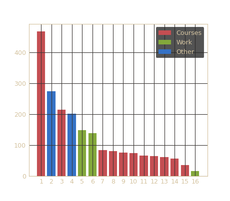
| Fig 1: A bar chart of the amount of hours spent on various activities (September 2020 - June 2021) |
The numbers on the x-axis correspond to the following activities:
| 1. | Thesis |
| 2. | Other TODOs |
| 3. | Project 3-1 |
| 4. | Study association Incognito |
| 5. | Software developer work |
| 6. | Coding teacher work |
| 7. | Software and Systems Verification course |
| 8. | Data Analysis course |
| 9. | Advanced Mathematical Techniques of Physics course |
| 10. | Intelligent Systems course |
| 11. | Introduction to Quantum Computing course |
| 12. | Optimization Course |
| 13. | Operations Research Case Studies course |
| 14. | Parallel Programming course |
| 15. | Game Theory Course |
| 16. | Student ambassador work |
By simply accumulating all hours per activity, we already see some interesting results! As one can expect, the thesis took the most amount of time in my senior year of university. I have worked only 3 months on it full-time and 3 months part-time, whereas I worked on my paid work (5. and 6.) part-time the whole year. Nonetheless, we can see that the thesis still took longer than any other one activity by a large margin.
Another interesting observation is that courses in my faculty are worth 4 ECTS which are worth 25-30 hours each. It follows that I didn't exceed the estimated amount of study time (~100 hours) for a single course (maximum was AMTP for which I spent ~76 hours total).
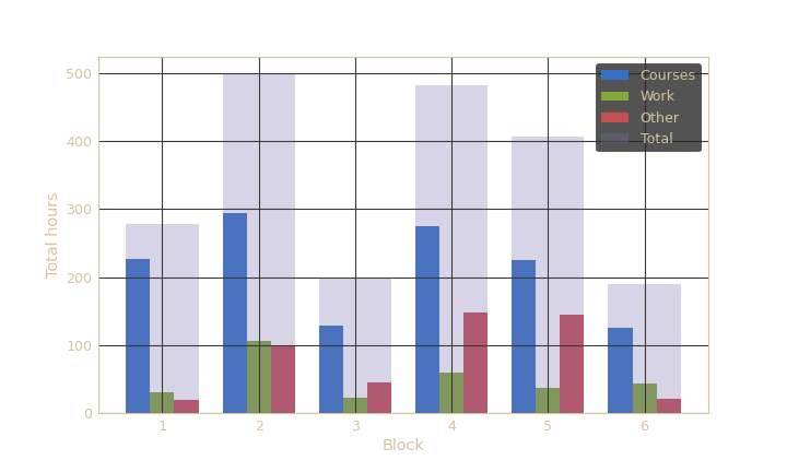 |
|---|
| Fig 2: A bar chart of course/work/other activity distribution per university block |
In Maastricht University blocks 3 and 6 are 4-week blocks whereas the other ones are 8 weeks long. The first block points to the fact that I worked the least in the whole year during this time. The truth of the matter is that I didn't track things as dilligently as I did later on so the data here is a bit skewed. I would not have expected to have such a big difference to the other full blocks, though. Many hours were contributed to the "other" activities in block 3 and 4. That is when I was part of a team working on writing a paper. Figure 2 seems to point to a perplexing fact: I was slightly less productive in block 6 than in block 3. Over the course of block 6 I was working on my thesis full-time whereas in block 3 I was working on Project 3-1 (which was the basis of my aforementioned paper). I would expect block 5 and 6 to be one of the most productive periods as I was working on my thesis full-time - it does not seem to be the case.
 |
|---|
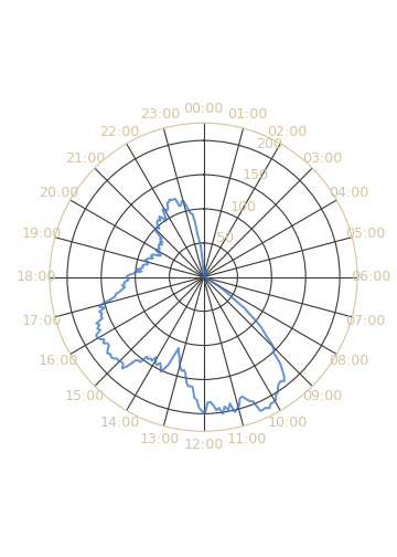
| Fig 3: A polar plot of cumulative productivity periods over the day (September 2020 - June 2021) |
In order to make this plot I split the total amount of time in a day to 5 minute bins: [0, 5, 10, ... , 1435, 1440]. Then for each activity tracked in clockify, I converted the times to minutes and split them in 5 minute increments. Simply aggregating the counts resulted in a temporal histogram which I plotted as a polar plot.
Figure 3 exhibits my most productive periods and when they occur throughout the day. One can discern three spurts from the plot. The longest and most frequent productivity period lasts from 8:30 am until 12:30 pm. The second-most prominent hill occurs after lunch between 3pm and 5 pm. It seems that my motivation dies off between 5pm and 9pm when I gain second (third?) wind for approximately two more hours.
 |
|---|
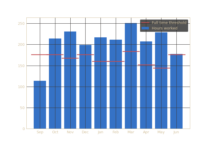
| Fig 4: A bar chart of total hours worked every month in my last university year as well as full time work thresholds per month |
This bar chart shows a straightforward measure: total hours worked per month. Also pictured are full time work thresholds for each month which were computed by multiplying number of business days per month by 8 (hours for full work day). September seems to be out-of-the-ordinary but as I've mentioned before this is due to me not tracking properly for a while. We can conclude that I have worked more each month than a full-time employee. In fact, I worked an average of 50 hours per week. June seems to be on the full time work threshold though that can also be due to the fact that I defended my thesis on 25th June, so I finished the productive period of the month early.
Sleep
I tracked my sleep using this script. Every day it would open a prompt on my laptop where I would input the amount of hours I slept the previous day. I started tracking my sleep start of 2019 but I lost a few months worth of data. So, the current dataset has values from end of March 2019 to end of July 2021.
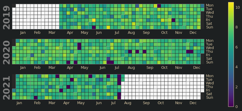 |
|---|
| Fig 5: A calendar plot of my sleep (mid-2019 - mid 2021) |
Looking at this plot you can get a detailed overview of how much I slept each day. The dark squares which seem to depict that I have slept 0 hours are outliers - I forgot to input the sleep data for that day. The colours do not seem to vary too much, they generally stay in the green shades of hue that depict 6-8 hours. It also seems that I did compensate for my sleep too much: I did not sleep significantly more after I had slept less.
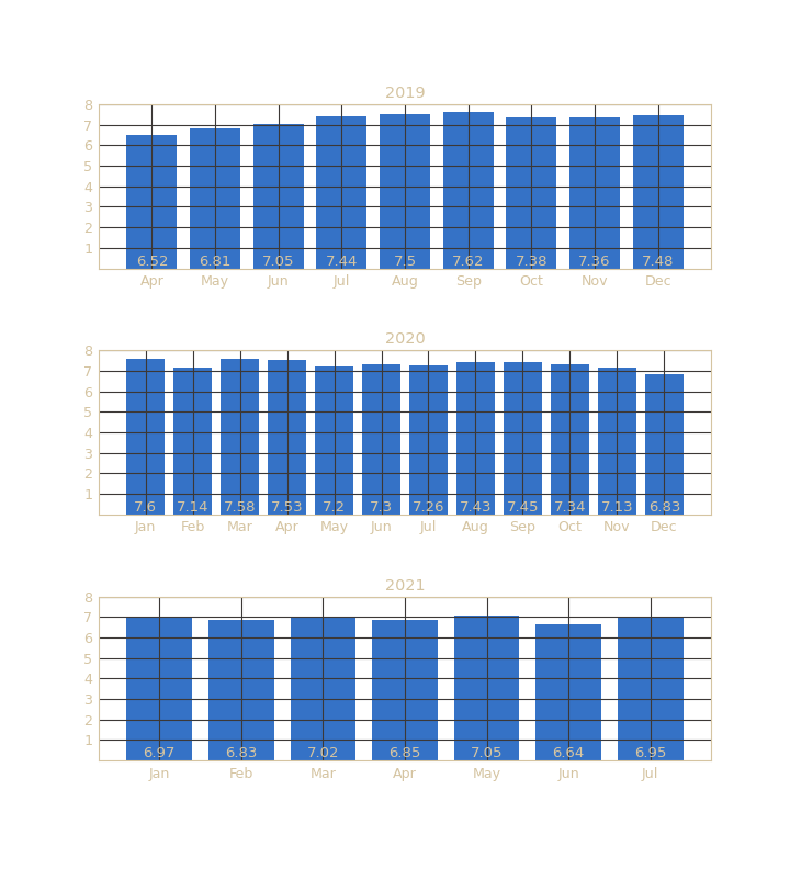 |
|---|
| Fig 6: A bar chart of average amount of hours slept per day per month (April 2019 - July 2021) |
I have slept more on average every day in summer of 2019. This trend, however, did not persist in 2020 as I slept quite well (> 7 hours) as well during university months. My senior year of university (starting September 2020) paints a different picture. The amount I slept on average gradually subsided and reached a plateau of around 6.9 hours in December 2020. It seems thesis and other obligations took a toll on my sleep.
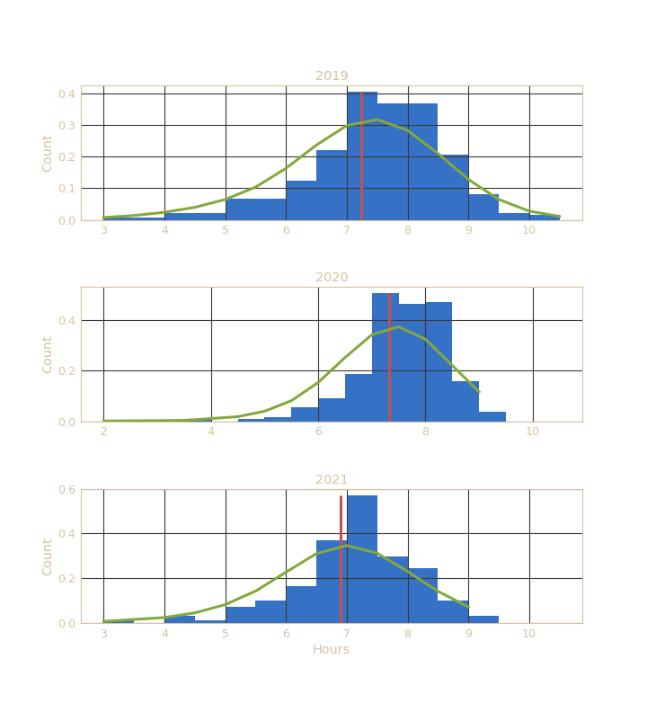 |
|---|
| Fig 7: Histogram of hours slept per day 2019-2021. Red lines depict the yearly means and green lines depict the KDE fit |
This plot reinforces the notion we have seen in the previous charts: 2020 was a good year for sleep. It would be very interesting to see how productive was I during that year as well and whether the amount of sleep influenced it somehow. Unfortunately, I did not collect productivity data for that time.
 |
|---|
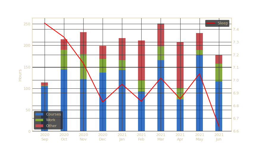
| Fig 8: A stacked bar chart showing the productive hours overlaid with a line plot of monhtly means of hour slept per day |
Here we can see that indeed my sleep quantity has decreased in my senior year of university. Interestingly, after my average amount of sleep reaches a valley in December, the total amount of hours worked increases if I sleep more and the other way around - my productivity decreases when I sleep less.
Finance
I acquired my financial data from my bank. It has a nice app which automatically classifies the topics of transactions. I pulled the data from there thus making the data acquisition process the easiest one of the three.
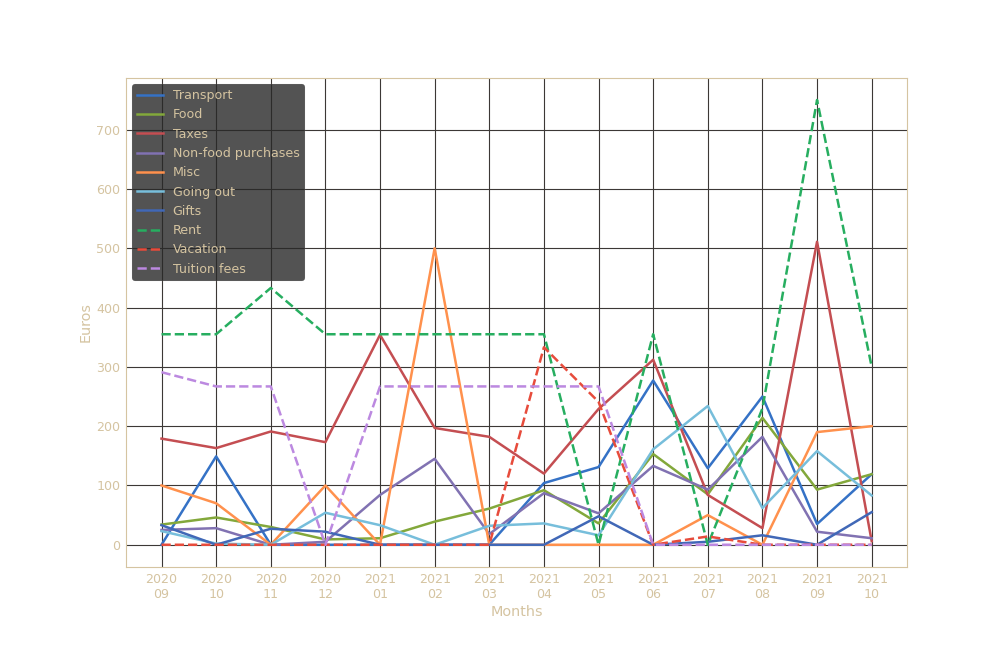 |
|---|
| Fig 9: Line plots of cumulative spending per month on various topics |
This is a lot of information. Dissecting these line plots and trying to make out what they mean might be quite difficult using only the naked eye. So, I will employ a time series correlation analysis tool that I developed for IconPro, the startup I work at. The algorithm attempts to disregard spurious correlations and computes the cross correlation function for any pairs of time series provided.
The results are two symmetric matrices: the first one shows the maximum correlation coefficients between any two univariate time series, and the second one is a similar matrix but now showing the lags at which the maximum correlations have been achieved.
| Transport | Food | Taxes | Non-food purchases | Misc | Going out | Gifts | Rent | Vacation | Tuition fees | |
|---|---|---|---|---|---|---|---|---|---|---|
| Transport | 1 | 0.624 | 0 | 0 | 0 | 0 | 0 | 0.406 | 0 | 0 |
| Food | 0.624 | 1 | 0 | 0 | 0 | 0 | 0 | 0 | 0.615 | 0 |
| Taxes | 0 | 0 | 1 | 0 | 0 | 0 | 0 | 0 | 0 | 0.234 |
| Non-food purchases | 0 | 0 | 0 | 1 | 0 | 0 | 0 | 0 | 0 | 0 |
| Misc | 0 | 0 | 0 | 0 | 1 | 0 | 0.486 | 0.561 | 0.793 | 0 |
| Going out | 0 | 0 | 0 | 0 | 0 | 1 | 0 | 0 | 0 | 0 |
| Gifts | 0 | 0 | 0 | 0 | 0.486 | 0 | 1 | 0 | 0 | 0 |
| Rent | 0.406 | 0 | 0 | 0 | 0.561 | 0 | 0 | 1 | 0 | 0.512 |
| Vacation | 0 | 0.615 | 0 | 0 | 0.793 | 0 | 0 | 0 | 1 | 0 |
| Tuition fees | 0 | 0 | 0.234 | 0 | 0 | 0 | 0 | 0.512 | 0 | 1 |
| Transport | Food | Taxes | Non-food purchases | Misc | Going out | Gifts | Rent | Vacation | Tuition fees | |
|---|---|---|---|---|---|---|---|---|---|---|
| Transport | 0 | 0 | 0 | 0 | 0 | 0 | 0 | -7 | 0 | 0 |
| Food | 0 | 0 | 0 | 0 | 0 | 0 | 0 | 0 | 4 | 0 |
| Taxes | 0 | 0 | 0 | 0 | 0 | 0 | 0 | 0 | 0 | -4 |
| Non-food purchases | 0 | 0 | 0 | 0 | 0 | 0 | 0 | 0 | 0 | 0 |
| Misc | 0 | 0 | 0 | 0 | 0 | 0 | 5 | -1 | -2 | 0 |
| Going out | 0 | 0 | 0 | 0 | 0 | 0 | 0 | 0 | 0 | 0 |
| Gifts | 0 | 0 | 0 | 0 | -5 | 0 | 0 | 0 | 0 | 0 |
| Rent | 7 | 0 | 0 | 0 | 1 | 0 | 0 | 0 | 0 | 3 |
| Vacation | 0 | -4 | 0 | 0 | 2 | 0 | 0 | 0 | 0 | 0 |
| Tuition fees | 0 | 0 | 4 | 0 | 0 | 0 | 0 | -3 | 0 | 0 |
Transport expenditure seems to be slightly positively correlated with that of Food (0.624). That might be because when I travel, I also eat out more which costs more. A similar result and interpretation follows Food and Vacation correlation with a coefficient of 0.615 with a lag of 4. The lag 4 here means that the results are correlated but 4 months apart which rings some truth: I pay for the vacation first and then some time later (after 4 months) I have an increase in food expenses most likely because of the vacation. Misc, that is, when I take out cash, seems to be slightly correlated with Gifts and Rent at lags 5 and -1 respectively. These results would hold more meaning had they been for lag 0. Misc is quite formidably correlated with Vacation (0.793) at lag -2 which is an odd one - it seems to show that I take out cash two months after I book vacation destinations. The other results in the table do not seem to make much immediate sense.
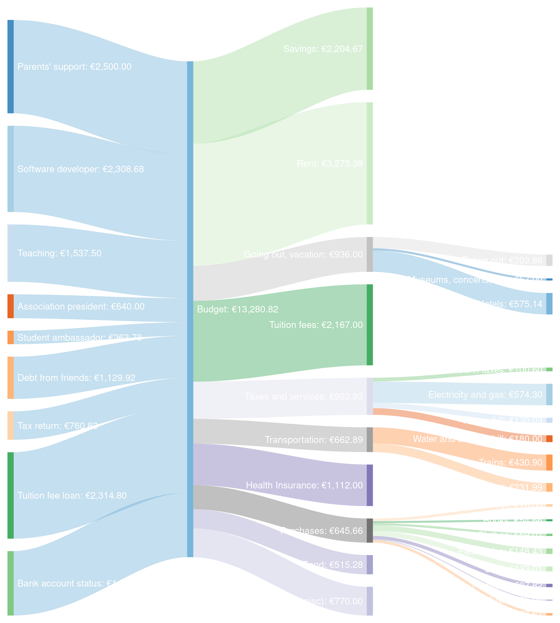 |
|---|
| Fig 10: A sankey diagram of my spending in last year of university (September 2020 - June 2021) |
The diagram portrays my sources of income and how I distributed my money during my senior year of university.
Regarding income, the software developer job, tuition fee loan as well as the support from my parents made up the largest part of my budget. The teaching job and the amount of saving I had up until that point also contributed significantly. The 'Debt from friends' does not mean I'm an oligarch that is lending people money.Instead it rather means that I paid for e.g. the whole group when we were eating out and they later sent me their share. Thus, the numbers on the right (spending) are slightly bloated because of this. It mainly affects the 'Transportation' and 'Going out, vacation' categories.
It is of no surprise that the biggest percentage of my spending is attributed to 'Rent'. I always thought that the tuition fees are not bad in the Netherlands but it's odd to see that the tuition fees approximately compare with rent with a ratio of 5:7. The reader might be puzzled about the low amount spent on food. This is because my flatmates were more often buying groceries and I had paid them back later which is not taken into account in this diagram. Another rather impressive observation is that it seems I did not indulge in senseless spending. 'Going out, vacation', 'Transportation' are highly correlated and I usually paid for two - the spending in these categories provided me valuable and precious experiences. The few purchases that I made over the 10 months were either important and/or meaningful to me. The bulk of the 'Cash withdrawal' cateogry is made up of the time I lent cash to my girlfriend to buy a kitten. Lastly, saving up 2.2k at the end of uni is a handy achievement.
Conclusion
In this post I summarized and explored the probable causes behind my productivity and finances last year, and how I slept over the past 2 years. It has been quite the arduous process to collect and make some sense out of this data. Having seen the various plots depicting my life and having discussed them, another question enters my mind: so what? What have I learned from this data? How will these conclusions help me in the future? Is quantification of the self a nonsensical and alien process for a human or is it a natural next step towards making humans more efficient and aware of their work and health?